Southwest Airlines Website Usability Study
Accessibility Considerations in HCI
Role: Researcher
Methods: Usability testing, SUS, ASQ
Timeline: September-November 2024
About
Travel websites are meant to make trip planning easier, but many still create major accessibility barriers for blind and low-vision (BLV) users who navigate with screen readers and assistive technologies. In 2002, Southwest Airlines was sued by accessibility advocacy group Access Now, which argued that the airline’s website was inaccessible to blind users. The lawsuit was dismissed before websites were legally recognized as places of public accommodation, but it raised important questions about accessibility in digital travel experiences.
Now, with Web Content Accessibility Guidelines (WCAG) standards and stronger digital accessibility requirements in place, my team conducted a usability study examining how BLV users navigate the Southwest Airlines website using screen readers and assistive technologies.
Research Questions
Is the Southwest Airlines website accessible to people who are blind or low vision?
How satisfied are users who are blind or low vision with their experience on the Southwest Airlines website?
What specific challenges do BLV users face while navigating the site?
Methodology

Methods
Remote moderated usability testing
SUS and ASQ questionnaires
Behavioral observation
Participants
Tasks
Search for a flight
Compare flight prices
Check flight status
Find accommodations page
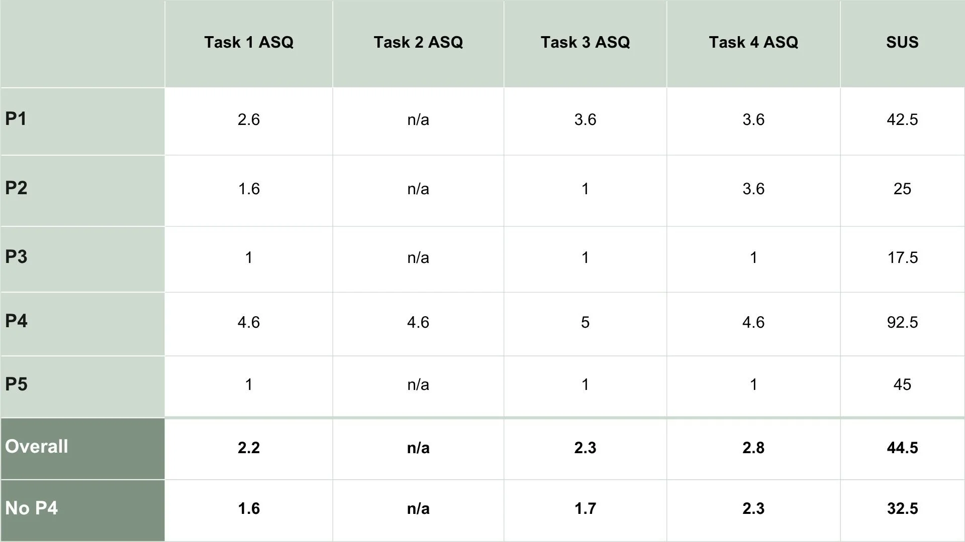
Findings
Task 1: Search for a flight
4/5 participants had difficulties selecting the departing/returning airports and/or the flight dates.
As a result, only 1 participant completed the task.
2 participants ran into issues as they encountered an ad for low fare booking with a CTA similar to form area.
Task Performance
Task 2: Find cheapest flight
This task was a continuation of task 1, so only one participant reached this task.
The participant successfully completed the task in six minutes with no issues.
Task 3: Check flight status
3/5 participants successfully completed this task.
2 of the participants who completed the task had some difficulties before succeeding.
P3 mentioned “this is normally when I call my friend”.
Task 4: Findings Accommodations Page
2/5 participants successfully completed this task and one participant encountered a testing error
Of the participants that completed the task, 1 wasn’t able to get their screen reader to read the main content of the page, only the headers and articles in the sidebar.
2 users who didn’t complete this task got very frustrated during task.
Too many ads and offers, so they couldn’t browse the entire website.
Results
Themes
Sharp Learning Curve
Indicated by P4 vs the rest of the participants.
P5, who is well-versed in accessible technologies, commented “I don’t think like this website does”, and explained that they think the website is indeed accessible, but only if you know how to use it.
Poor Navigation
The website includes multiple navigation bars and menus that contain redundant information.
Large advertisement banner as the first item on the page with button label “Book now” - same as in navbar
Not Screen Reader Friendly
Date calendar and destination text boxes open and close at random with screen readers
Page structure is not easily navigable - repeat headers, long lists of links, ads
Recommendations
Based on our observations and test results, we suggest the following changes to improve the Southwest Airlines website for BLV users:
