Gather’d: A Community Kiosk for Older Adults
HCI Capstone
Role: Researcher, Designer, Team Coordinator
Software: Qualtrics, Proven By Users, Figma
Timeline: January-March 2025

About
Keeping seniors in residential care connected and informed is harder than it should be. Gather'd is an app and kiosk platform that gives communities a centralized way to communicate with residents and families — from event sign-ups to meal ordering.
Gather’d was designed for residents living in long-term residential care settings and their families to use via kiosk and mobile apps.
Methods
I. Literature Review
We conducted a literature review to understand what motivates older adults to engage with technology, what barriers they face, and what role community plays in residential care settings. Our findings fell into three main categories: sense of community, technology design for older adults, and the benefits/accessibility of kiosks.
Sense of Community
Strong community ties improve satisfaction and well-being.
Higher life satisfaction correlates with better health outcomes.
Positive resident experiences in care communities encourage others to join.
Technology for Older Adults
Older adults face sensory, motor, and cognitive barriers.
Training can mitigate technology anxiety.
Best practices: adjustable fonts, simple navigation, and large touch areas.
Benefits of Kiosks
Kiosks are preferred over complex devices.
Accessibility features (large screens, simple interfaces) improve usability.
Many kiosks lack proper accessibility; standards should be followed.
II. Competitive Analysis
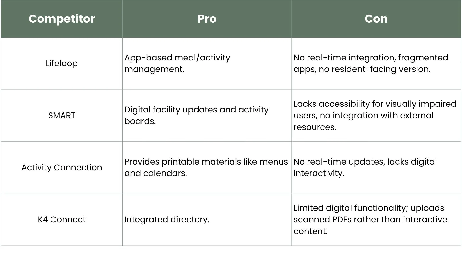
While these platforms each offer useful features, none provided a fully integrated, accessible solution built specifically for residents, confirming the need for Gather'd.
III. Survey
We surveyed 40 participants to understand our audience's preferences, needs, and pain points. The survey covered seven areas including user satisfaction, accessibility challenges, feature preferences, and device preferences. Key findings revealed that many respondents were dissatisfied with current communication methods, required assistance using digital tools, and preferred features like FAQ pages, personalized calendars, and meal menus, which directly shaped what we built.
Based on our survey findings, we developed two personas to represent our primary user groups throughout the design process.

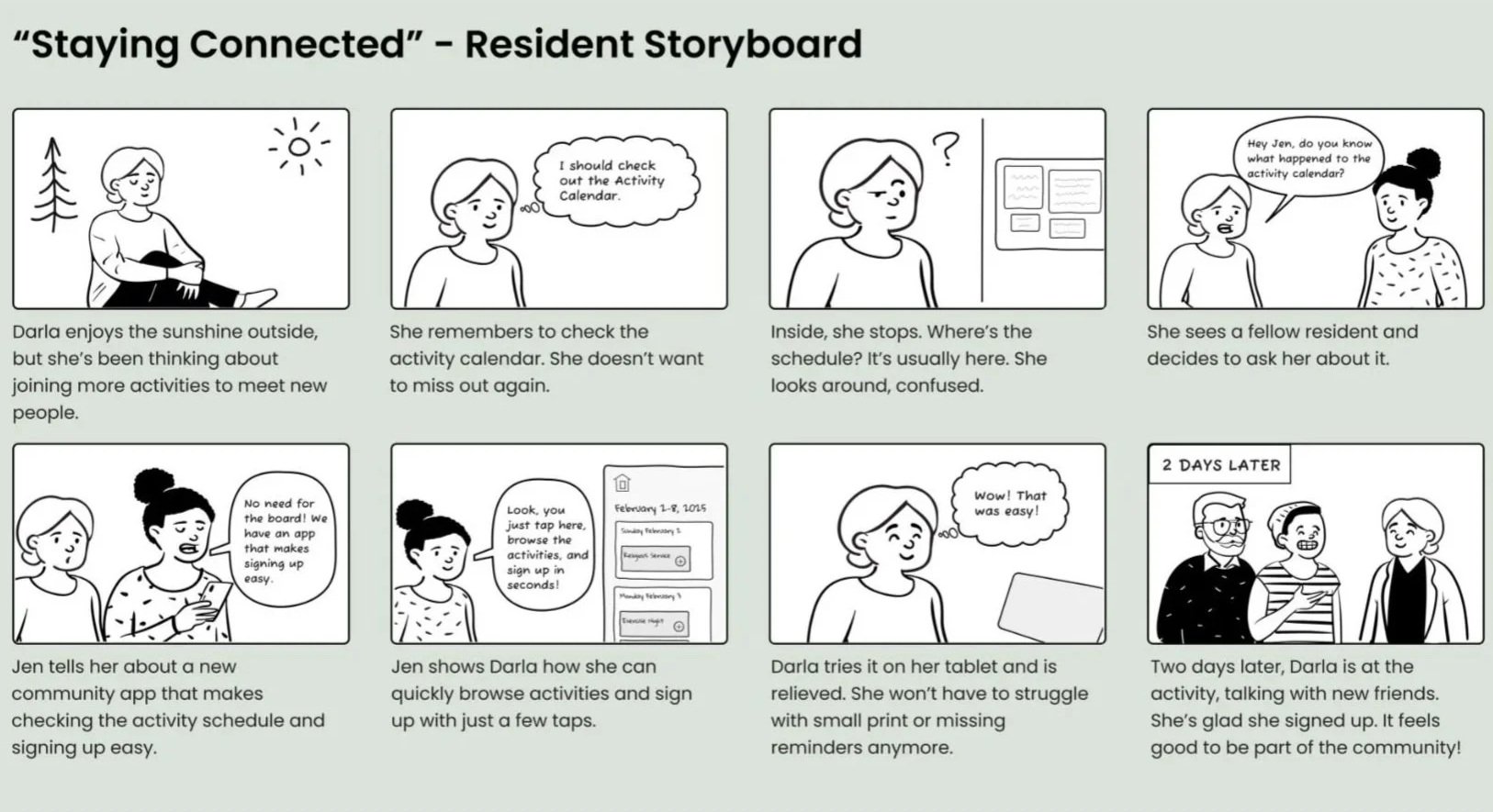
We created a storyboard to map out how a resident like Darla might discover and use Gather'd in her daily life.
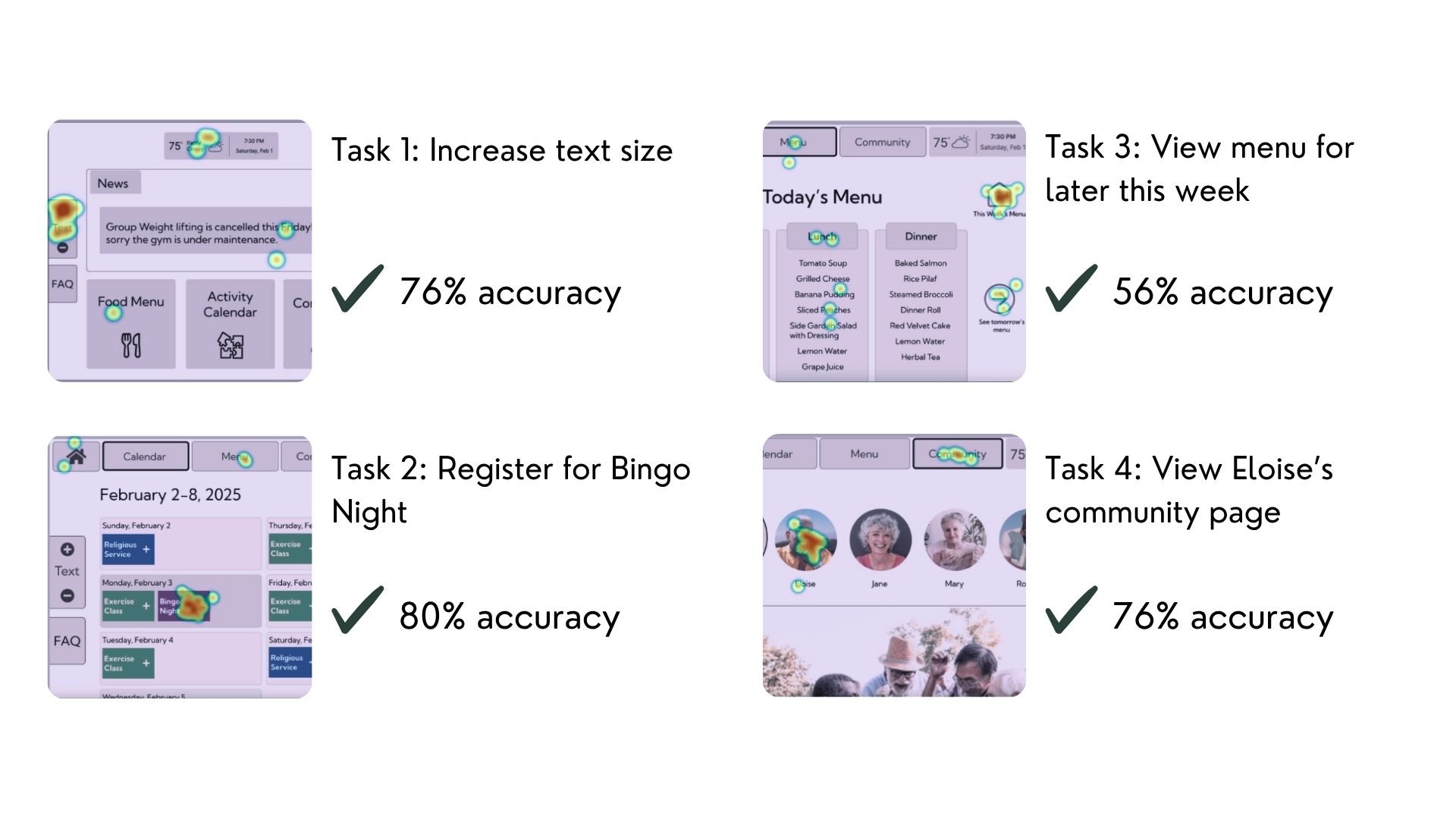
IV. First Click
To test whether our mid-fidelity designs were intuitive, we ran a first click study with 31 participants using Proven By Users. Participants were given four scenarios and asked to click where they would go to complete each task. Results were strong overall, with three of the four tasks achieving 76-80% accuracy. The exception was viewing the menu for a specific day, which came in at 56% accuracy — indicating that the menu navigation needed clearer visual cues.
V. Usability Test
We conducted usability testing with 10 participants via Zoom to evaluate the functionality of our mid-fidelity prototype with real tasks. Participants were asked to sign up for Bingo Night, view the lunch menu for Thursday, and navigate community resources.
Sign up for Bingo Night
80% success
All users found the steps easy to follow
Text size and placement were noted as areas for improvement
View lunch menu for Thursday
40% success
30% of users didn’t recognize certain elements as clickable
40% of users struggled to locate the correct date
Navigate community resources
50% success
70% of users struggled to find the Member Pages section
50% of users found the wording unclear
Limitations and Future Work
Limitations:
Given the project timeline, we prioritized research and usability testing over visual refinement, which is reflected in the mid-fidelity state of our final designs.
Most of our participants were visitors and family members rather than current residents, and only one identified as an older adult, so our findings may not fully represent the population we were designing for.
We were unable to conduct another round of usability testing after making iterations, which would have helped validate our design changes.
Future Work:
Redistribute features between kiosk and mobile interfaces based on usability test results.
Develop admin pages and more detailed resident profiles.
Conduct a second round of usability testing with a larger sample of older adult residents.
Build and implement a design system to establish visual consistency across screens and elevate the designs to high fidelity.